- Published on
A CSS Checklist
- Authors

- Name
- K N Anantha nandanan
- @Ananthan2k
Introduction
In this blog, I will document some CSS checklist that could be a general fit in most websites so that in the future I can use it as a reference.
CSS Checklist
Line Length
- [ ] Line length should be between 45-75 characters
A good measurement to use in units of ch is 45-75 characters. This is a good range to use
h1,
h2,
h3,
h4,
h5,
h6,
p,
li,
td,
blockquote {
  max-width: 60ch;
}
Line Height
- [ ] Line height should be between 1.3-1.6
We don't want out text in the websites to be soo close as if they are kissing each other LOL. We want to give them some space to breath. A good range to use is 1.3-1.6
body {
  line-height: 1.5;
}
Font Size
The best choice for font size is to use rem unit. This is because it is relative to the root element
which is the html element. This means that if the user changes the font size in the browser, the
whole website will change accordingly.
So the default font size is 16px. And thus 1rem is equal to 16px.
- [ ] Use
remunit for font size
body {
  font-size: 1rem;
}
width and height
For the majority of the cases, we can use percentage for width and height. This is because it is relative to the parent element. So if the parent element changes, the child element will change accordingly.
Another aspect is to use max-width. This is because we want to make sure that the website is
responsive. So we want to make sure that the width of the element is not bigger than the screen
width.
In the case of height, we can use min-height to make sure that the element is not too small.
- [ ] Use percentage for width and height
- [ ] Use
max-widthandmin-heightto make sure that the element is not too big or too small
Let's say for a container, if we want it to be 80% of the screen width and 100% of the screen height, with a bit of padding, we can do something like this:
.container {
  width: 80%;
  height: 100%;
  padding: 1rem;
  max-width: 100%;
  min-height: 100vh;
}
NOTE: Here vh stands for viewport height. So 100vh means 100% of the viewport height. Only use it
for a container that you want to be 100% of the viewport height. The rest of the elements should use
percentage.
Margin and Padding
- [ ] Use
remfor margin and padding
.container {
  margin: 1rem;
  padding: 1rem;
}
Border
- [ ] Use
remfor border
.container {
  border: 1px solid black;
}
Kind of see the pattern here?
I haven't used px for most of the properties. If we leverage the power of rem or em, we can
make our website responsive.
Understanding rem and em
rem is relative to the root element which is the html element. So if the user changes the font
size in the browser, the whole website will change accordingly. The usecase for rem is for font
size.
em is relative to the parent element. So if the parent element changes, the child element will
change accordingly.
The Sibling and Child Selector
This is one of those I always forget and have to look it up. So I will document it here. Basically
the sibling selector is + and the child selector is >.
Sibling Selector
.container {
  margin: 1rem;
  padding: 1rem;
}

.container + .p {
  margin-top: 0;
}
So taking the above example, basically a adjacent sibling selector is used to select all elements
that are the adjacent/immediate sibling of the specified element. So in this case, we are selecting all
elements with the class p that are the adjacent/immediate sibling of the element with the class container.
Adjacent in this case means that they are next to each other and they share the same parent.
Child Selector
.container {
  margin: 1rem;
  padding: 1rem;
}

.container > .child {
  margin-top: 0;
}
In this case, we are selecting all elements with the class child that are the child of the element
with the class container. Child in this case means that they are nested inside the parent element.
Positioning
One of the stuff that I always mess up is positioning. Especially when it comes to absolute and
relative.
Relative
So in very simple terms, relative means that the element is positioned relative to its normal
position. So if we have an element with position: relative, and we give it a top: 10px, it will
move 10px from its normal position. And the surrounding elements will not be affected. And they
will be positioned as if the element is still in its normal position.
Absolute
When it comes to absolute, simply put, it means that the element is positioned relative to its
closest positioned ancestor. So if we have an element with position: absolute, and we give it a
top: 10px, it will move 10px from its closest positioned ancestor. And the surrounding elements
behave such that the element is not there.
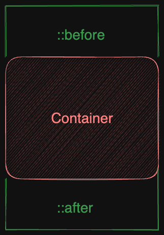
::before and ::after
These are pseudo elements. They are used to insert content before or after an element. So let's say
we have a div with the class container. We can use ::before and ::after to insert content
before and after the div element.
.container::before {
  content: 'before';
}

.container::after {
  content: 'after';
}
Conclusion
So that's it for now. I will keep updating this blog as I learn more about CSS and as I find more stuff that I can add to this checklist. Whether it being a best practice or something that I personally find useful.